Average weather, and where the Market is
A major player in evaporative cooling manufacturing approached us for a project exploring their expansion into the home patio market. As a first look we needed to understand where higher value homes existed and how temperature and humidity change the appeal of “swamp coolers” for the patio. There were quite a few inputs and decisions that were needed to build an average day in an average month model.
Assumptions and sourcing the data
The first set of decisions had to do with the households to target. What was the indicator to use for sizing a market? Ideally we would have a count of all houses with large patios! Unfortunately, this is something that was not readily available. What we did have was count of homes by block group by home value, this was provided within our GIS tool Esri's ArcGIS. It was settled that single family homes with a value over $500k would be counted towards the total market size. The goal was to not be overly exclusive, but still limit home counts to those who are more likely to have a patio, and can afford an expensive accessory to go with their other patio furniture. This decision would be a very good one to revisit once sales data is available.
The second decision has to do with temperature; It was decided that the average temperature for the month would need to be above 72 degrees Fahrenheit and that the output temperature of the cooler would need to be at or below this threshold. If both of these conditions are met markets at the zip code level would be activated for that month. While it is easy enough to collect historical weather data for zip codes, understanding the output temperature of an evaporative cooler is a little more complicated.
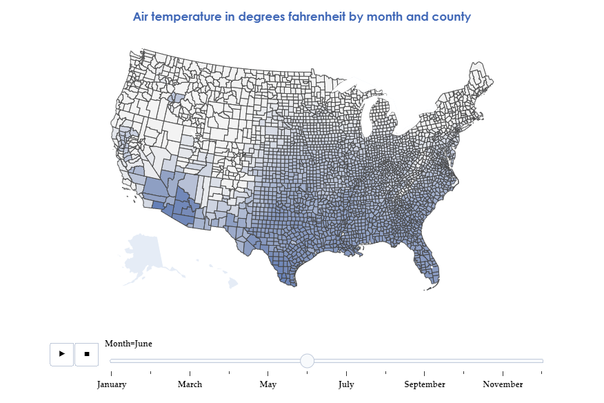
This map shows the average air temperature. This was important for turning off markets that were too cold to need cooling, and calculating the cooling performance.
Modeling average performance
Since evaporative cooling works off of the evaporation of water, a cooler that has perfect efficiency would output air that is equal to the wet bulb temperature. Wet bulb temperature is the lowest theoretical temperature a wet thermometer could reach at a given humidity and air temperature combination.
Wet bulb can be estimated as such:


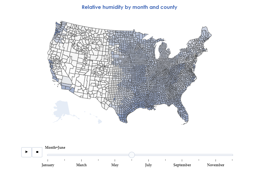
Here we can see the average humidity by month. The relation between humidity and cooling efficiency is critical.
Now that we have temperature and humidity data, we can estimate performance by calculating the wet bulb temperature in these conditions and then discounting the output by a known efficiency factor for the product. When this is done we have a rough estimation of the output air temperature of the cooler.
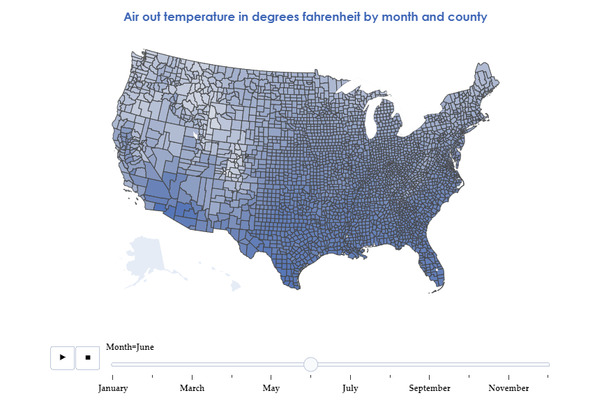
This map shows average performance as measured by the output air temperature.
Finding the markets
Using our found output temperature and our known air temperature, we can determine on a monthly basis which markets meet the criteria for activation (above 72 degrees air and below 72 degrees out). We can then combine the market status with our $500k+ homes to dynamically size the market by month. This allows us to better plan for the seasonal impact and offers a framework for using real time weather data in the future to better optimize media.
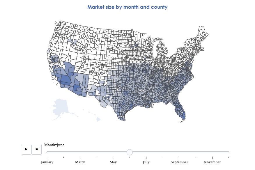
Here we can see the final household counts rolled up to the county level. Temperature, efficiency and market activation have still been calculated at the zipcode level and are summed within their primary county.